Resources

Thursday, November 26, 2015

Reasons for Declining Medicare Part D Reimbursement - and What They Mean for Healthcare Stocks

In its 3Q15 earning call, CVS explained that its margins declined due to higher proportion of lower margin Medicare and Medicaid business. Here I want to focus on Medicare, and specifically Medicare Part D (the drug portion), which obviously have big impacts for the PBMs (CVS, ESRX), pharmacies (WBA, RAD), and the rest of pharmaceutical supply chain from distributors to drug manufacturers. 

Pharmacies like WBC have been talking about drug reimbursement pressure for a while. Much of that stems of their weaker bargaining position relative to PBM and payers. But what has not been discussed enough is that Medicare Part D revenue per member has deteriorated several years in a row.

Reimbursement Pressure Starts at Health Plans and Propagate Through Supply Chain


There are lots of online articles on drug costs to the enrollee, but figuring out what the government pays health insurance companies is not straight forward. Fortunately, chapter 6 of this Medpac report has a detailed explanation of how Part D reimbursement works, and even an example of how plans bid. From the same report (shown below) is Medpac’s measure of government outlay in Part D plans.


How much is the government paying health insurers

From this chart it’s clear that “expected reinsurance” has been steadily increasing, while “base premium” and “direct subsidy” have been steadily decreasing. A quick note about how this works. “Direct subsidy” is what government pay to health plans directly. “Base premium” is what enrollees pay. “Expected reinsurance” is what government reimburse the plans after drug costs exceed some catastrophic threshold. 

Since reinsurance is used to cover catastrophic drug costs, what the plans really get is direct subsidy and base premium, or what CMS calls the “National Average Monthly Bid Amount”. This is a good proxy of a health plan’s revenue, from which it needs to cover drug costs (below the catastrophic threshold) and administration costs, with the remainder going to plan profit *. The table below show that the average bid amount has been declining steadily, which led to reimbursement pressures throughout the entire drug value chain. For 2016, the industry will see another steep drop of 7.6%.


Reasons for the Decline


Why is this happening? First, what is not an adequate is the argument that health plans are not actually seeing reimbursement pressure, because the overall bid amount including reinsurance has actually been increasing. From the plan’s perspective, reinsurance just compensates for extraordinary costs and does not add to the bottom line. As for the base elements, even the MedPac report cited above - which alleges that sponsors use clever bidding strategies to maximize profits - the example given (page 163, table 6-11) clearly shows that gaming the bid system would lead to higher, not lower bid amounts (Case 3 in the example is what the plans have been doing. Based on actual claim experience the direct subsidy and beneficiary share should have totaled $46.50, but the plan bid totaled $60.00 those items).

So the way to reconcile a) ever higher reinsurance payments with b) ever lower bid amounts is that government and private sectors are both sharing the pain of higher drug costs. The government has been taking on more catastrophic risks, while private sector focused on efficient day to day administration. In this way both utilize their comparative advantage.

So the fact that bids amount have been lower every year is not about plans ripping off the government, but due to genuine industry competition. There are various explanations:
  • The “National Average Monthly Bid Amount” is weighted by enrollees. So as low cost plans win over more enrollees the weighted average would be dragged down.
  • The larger plans have been aggressive as scale allows them to lower operating expenses and push through formulary changes. 
  • Generic conversion have lowered regular drug cost, while government took on the tail risk of the Sovaldi/Harvonis of the world.
  • Medicare Advantage plans with drug benefits (MA-PD plans) can bid lower as the Part D is small portion of overall revenue (Part D bid amount will be $64.66/month in 2016E, while Part C benchmarks are easily $750-800/month)


Investment Implications


The above drivers are not about to go away soon, so this trend of lower bids and worse economics for entire drug value chain could continue for a while. In the longer term though, large players like CVS and UnitedHealth might actually benefit as lower margins drive out smaller competitors. In terms of ability to withstanding constant Part D reimbursement pressure, I would rank the various players from best to worst as follows.
  • Managed care companies. (UNH, AET, HUM) Medicare Part D in general is a smaller part of their business. If the Aetna/Humana merger goes through, the combined entity will be a major player in MA-PD plans and can continue to push bids lower to take market share.
  • Standalone PDP / PBMs (CVS and ESRX). Both CVS and ESRX are large players in the standalone PDP space. They are at a disadvantage relative to managed care companies but have been able to exert strong bargaining power over the rest of the supply chain.
  • Pharmacies (WBA, RAD) and drug distributors (MCK, ABC, CAH). These have weak bargaining power. The pharmacies in particular have been beaten up by PBMs. Their only hope is more consolidation as in the Walgreens Rite Aid deal. The major pharmacies and drug distributors have also teamed up to get more market power.
All the industry participants above have low margins. The managed care companies even have legal caps on their profitability. So going forward the big costs savings will have to come out of the drug manufacturers, specifically the specialty drug companies. The specialty drug companies are a totally different game. On the one hand they are prime targets for price cuts. On the other hand it’s hard to cut prices without political action, and even if price cuts go through these manufacturers have some fat margins anyways.

I am holding on to my UNH and AET shares despite the political rhetorics sure to come in 2016. I particularly like the idea of a combined AET/HUM dominating the growing Medicare business. CVS is a tough call as it a well-run company but its pharmacy business will likely bear reimbursement pressure for years to come.


* Notes: Some analyst reports calculate plan revenue as average bid amount + enrollee premium. That is incorrect, as the enrollee’s base premium is calculated as a percentage of the National Average Monthly Bid Amount, which implies the latter is inclusive of enrollee premiums)


Monday, November 16, 2015

Gold Call Options

I bought a small amount of GLD call options today.

I got into the June $115 call for $1.59. I think this is a much better way to gain exposure than going outright long. With GLD trading at $103.5, maximum loss on this trade is only 1.5% of the long exposure obtained. I'm also long USD (currently against NZD and EUR), so some gold will help in case the Fed hike thesis falls apart.

Gold has been beaten down to multi-year lows and I can understand why. The Fed can't stop talking about raising rates. Inflation is no where in sight. Marginal costs for gold producers keep declining over the years, and will get lower if the US dollar strengthens. Jewelry demand, roughly 50% of total demand, will likely be weak in a low growth environment. Finally, after a massive build up over the past decade, ETFs has been decreasing their gold holdings the last couple years.

So why a long position? These call options are a low risk, high reward way to go contrarian on the consensus view that Fed will raise rates in December.

First take a step back. Gold has four functions: 1) as a safe haven/physical currency, 2) inflation hedge, 3) jewelry, 4) industrial use. Right now the only reason for anyone to own gold is the first one - gold as a currency. This is really the flip side of US dollar strength, which has everything to do with market's expectations of a rate hike.

Expectations

It wasn't that long ago (just September!) that the Fed failed to raise rates and cited risks in China and low inflation. Every other day some Fed officials (Lacker, Bullard, Lockart, Brainard...etc) took their turn going rogue on media and gave contradictory statements.

Now, just a couple months later, everyone is supposed to have suddenly fell in line and agree to raise rates? That hardly seems credible to me.

Last year's experience made clear a few things about the Yellen Fed regime. First, the Fed takes into consideration a lot more than its dual mandate of inflation and unemployment. Some of these unstated factors include general market stability, US dollar strength, and yes - China. Second, the Yellen Fed does not like to surprise the market, so October's hawkish Fed statements was just a way for Yellen to raise expectations of a December hike in the market. Put another way, October's Fed statement was just to keep their options open. Finally, we learned that it doesn't take much for the Fed to delay that rate hike -- perhaps permanently.

Given the lessons above, and all it takes is a weak inflation number, a couple bad numbers out of China, or another market meltdown to lower the probability of the December hike.

As for gold, market expectations about the rate hike is what matters. If any of the above happens, the call option will likely be a winner. There's also very little downside. Depending on how macro data comes out, I might increase this option position.

Friday, October 30, 2015

What’s Dragging Down Core Retail Sales?

One of the biggest questions in corporate earnings is how the US consumers are doing. We know housing continues to recover, if in a sluggish fashion. We know auto sales are doing well, driven by light trucks. How about retail sales? 

Headline retail sales have continued to increase but showing signs of deceleration. This number is heavily influenced by auto & auto parts though –which we already know is strong. On the other hand, gasoline prices have dropped significantly and that drags down the headline numbers even though it should benefit consumers.

So I consider “core” retail sales – excluding auto and gasoline sales – as a more accurate reading for U.S consumers. The growth in this number is shown below.


Notice that post 2008, growth in “core” retail sales have hovered around 3-5%, slower than the 5-7% range pre-crisis. So I dug a little deeper to see which sector is dragging this down.

The Census Bureau report divides retail sales into 13 categories - motor vehicles, furniture, gasoline, building materials, and so on. Going through the data, I found the biggest drags come from 2 sectors: general merchandise stores and building materials.

The contributions of these 2 sectors to core retail sales growth are shown below.


The declining growth in general merchandise stores might have something to do with offsetting growth in online shopping (although apparently not enough to offset overall sales since the headline number does include e-commerce.) .

The other major drag on growth is the “building materials & garden equipment & supplies dealers” category. Growth has recovered but has not yet reached pre-crisis levels. The good news here is that new home sales – as shown by the link in the first paragraph – should have plenty of room to grow.


Looking out the next few years, I can see a housing pick up driving core retail sales up toward pre-crisis levels. Gasoline prices will also stabilize and be less of a drag on headline growth.

Friday, October 16, 2015

Which Securities are Most Likely to Trend?

The title really should be “finding the least efficient markets – Part I”. But that’s such a broad subject I will just focus on one little part of that here.

Greenblatt’s book “You Can Be A Stock Market Genius” outlined some intuitive ways to find inefficient markets – spinoffs, M&A, bankruptcies…etc. But one of the most common forms of inefficiency is right there on the stock chart – the trend.

If you visualize the price chart of a perfectly efficient security, what would that look like? I imagine it would have sudden gaps up or down as new information comes out, followed by flat lines in times of no news. This is because in a perfectly efficient market, rational investors absorb and digest the same information instantaneously, and that should immediately be reflected in prices.

But often we observe security prices that trend. Prices go up for 3 days in a row, a week in a row…and so on. To me that is proof that the market is not perfectly efficient - there are delays in information dissemination, interpretation, and actions on the parts of investors. Whatever the causes, the trend presents good trading opportunities.

The trend is your friend. But how do you identify securities that are most likely to trend? We need ways to quantify “trendiness”. Here is one simple way to do it: count the number of times where prices move in the same direction (“sequence”), divide by the number of times when prices reverse (“reversals”). This is called the “Cowles-Jones ratio” (CJ ratio).

For example if you have price time series data that goes like this: 1, 2, 1, 2, 1, 2. That’s 5 reversals and not a single “sequence”. The CJ ratio would be 0. On the other hand, if your data is this: “21, 22, 23, 24, 19, 18” That’s 4 times where price moved in the same direction and 1 reversal. (22, 23, 24 all moved in the same direction, then a reversal on 19, and finally 18 moved in the same direction as the last number). In the latter case the CJ ratio would be 4 / 1 = 4. So if you go long the security whenever price first ticks upward, your chance of winning is 4 times that of losing.

Calculating this number for SP 500 components from 1/1/2013 to 9/30/2015, I find the average CJ ratio to be 97%. I expected a number close to 1 so this is reasonable. Below are the stocks that with CJ ratios that are 2 standard deviation above the mean – i.e the trendiest stocks since 1/1/2013.


So the “trendiest” stocks have CJ ratio around 1.1 – 1.2 range. A simple strategy would go something like this: go long whenever you see prices shift directions and go up; and short if prices reverse and go down. Your win percentage would be better than 50/50.


Now check out the common currency pairs. Total trading days are more than those for stocks because the stock market get various holidays off.


Note that even the least trendy FX pair is more likely to trend than the trendiest of stocks! That makes sense to me. The forex markets are full of non-economic players like central banks and commercials for whom profit maximization is not the top priority. Then you also have mom and pop participants. When my dad wants to buy some NZD he literally goes to the local banking branch and buy them! That surely creates lags and opportunities not seen in the stock market.

These numbers change depending on what time period you use. But in general I do find currencies to be trendier than stocks.

There are other ways to measure trendiness – perhaps one can quantify autocorrelations, or run backtests using simple moving average crossover rules and then rank the results. As I learn more ways to detect trends (and get more mathematically skilled) I will post my discoveries.

Friday, October 2, 2015

Notes on Archer-Daniels-Midland (ADM)

ADM is one of the largest grain processors in the world. The 4 major segments are 1) Agricultural Services - which store/transport/trade commodities, 2) Corn Processing – this turns corn into sweetners and starches. Importantly this segment also includes ADM’s ethanol operation. 3) Oilseeds Processing – where ADM does crushing & origination. Soybean related products are key here. 4) Wild Flavors – a new segment that does specialty food ingredients.

Why am I looking at this in the first place? My bull hypothesis is as follows: 1) As a processor that takes soybean and corn as inputs, weakening commodity prices should help ADM’s margins. 2) Despite the cyclicality, over the long run demand for ADM’s products should be very stable. 3) As the world consumes more proteins, ADM’s volume should grow at higher than GDP.

I also think ADM is a good company to track due to availability of related data. I can monitor data from commodity futures and USDA to constantly update, prove, or disprove the above hypothesis. Things like soybean crush spread, ethanol prices, currencies are available in real time and inform one’s view on ADM.

Segment Contribution and Drivers


Here is a quick rundown of each segment’s contribution to operating income (last twelve months), as well as their drivers:

Oilseeds processing (42% of operating income)

  • The key grain here is soybeans so I compared current soybean crush spread against historical levels. Current industry crush spreads (see appendix at the end of the article) are near all-time high but declining, which points to downside for ADM. My first bull hypothesis – that declining commodity prices should help ADM’s margins –thus appears already played out and in fact fading. 
  • However, ADM’s oilseeds margins (in terms of $ per ton processed) were stable the past few years even as industry crush spreads fluctuated. My guess is ADM will be relatively stable when industry spreads decline as well. But I certainly would not count on much upside from margin expansion. 

Corn processing (24% of operating income)

  • Operating profit from ethanol was down ~$220mm in 1H2015. Some of that will be recoverable as ethanol margins recover, creating upside in the segment.
  • However, it seems that analysts are already building in ethanol price recovery (perhaps due to expectations of oil price recovery). Consensus has EPS of 3.08 and 3.40 for 2015E and 2016E. This 10% growth will be hard to come by without ethanol at least stabilizing. Besides, the days of $100 oil are over and ethanol margins are unlikely to fully recover to past levels.

Agricultural services (27% of operating income)

  • This is storage/transportation/trading…etc. Historically profit here relies on level of US exports, which is a function of how competitive US is versus say, Brazil. With USD strong and the Brazilian real weak, this segment is unlikely to see much advantage. The near upside here is 1) El Nino somehow destroys Brazilian crops, and 2) US has a great crop. 

Wild Flavors (6% of operating income). This could be a growth area for years to come but not enough to offset the importance of the other segments.

Upside Assessment and Current Action Plan

Looking through the main segments, I just don’t see much earning upside beyond those already factored into the consensus. Thus returns will have to come from multiple expansion, which will likely happen if ethanol stabilizes and exports don’t fall apart. In terms of valuation, right now it trades at 11.9x TTM vs 10yr median of 13.3x. That’s a 12% upside from recovery in multiples. In terms of downside, soybean crush margin can weaken, ethanol stabilization can come later than expected, and Brazil and China can enact policies that hurt US competitiveness and export levels.

This is not enough for me to get in. For now I will sit on the sidelines and wait for fundamentals to get better.


Appendix: Historical soybean margins

I calculated these from front month futures data and the formula Soybean crush = soybean oil (in cents/lb) * 0.11 + soybean meal (in $/short ton) * 0.022 - soybean prices (in $/bushel).  The crush spread is still higher than historical because soybean meal is a larger contributor than soybean oil, and soybean meal prices has not came down as much as the others.

historical soybean crush spread ($/bushel)

soybean complex historical data


Friday, September 11, 2015

Australia’s Trade with China: Export Iron Ore, Import Women

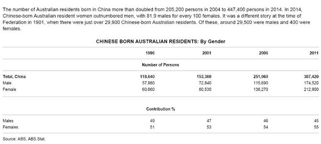
Australia’s latest balance of payment data included a special case study on trade with China. Scroll to the bottom of that link and you’ll see some interesting stats. 

Australia’s Trade with China: Export Iron Ore, Import Women


These male to female ratio looked a little skewed? Especially we’re talking about China here - a country known for too many men.

And Australia gets them young too.


I knew Australia has a trade surplus with China, but I didn’t know it was this good!


Saturday, September 5, 2015

Miscellaneous Thoughts about the Market

Here are some thoughts I had about the market in recent weeks. The first 2 sections explain why I think the S&P 500 is still overvalued eve after the recent drawdown.

Earning growth expectations for 2016E still unrealistic


Below are revenue and earnings performance of S&P500 for past 10 years, 2016E data are based on analyst estimates. (I got the data from here)


Notice that in 2016E S&P revenues are supposed to grow 6.3% and earnings 10.5%. Digging deeper into the Factset file referenced above, you can see this is because the analysts are assuming 1) energy sector rebounding sharply, 2) all time high margins.

These assumptions strike me as unrealistic. Regarding the former, the energy sector is expected to grow 19% in 2016 – and this is after being revised downward from 34% a few months ago. The risk is if oil stays lower for longer that 19% earnings growth may not pan out. Regarding the latter point, how we’re supposed to see all time high margins is beyond me, especially when margins have been trending down in recent quarters.

Even if energy sector rebounds sharply, forward P/E multiples should not be high because that’s a one-off rebound, not a recurring growth pattern.

The idea of “low rates justify higher forward P/E” is double counting


Two most often heard reasons for high valuation multiples the past year are 1) low rates, 2) growth. The theory is that the “justified” P/E ratio is calculated as dividend payout divide by (required return on equity – growth). Where required return on equity is defined as risk free rate + “equity risk premium”. Leave aside the equity risk premium which is not directly observable, low rates and strong growth should lead to higher valuation multiples.

This all seem very sensible but does not jive with the data – at least not the rates part. If you run a regression where y = earning yield, X1= 10yr US Treasury rates, X2 = earnings growth, the result (which surprised me) would show that interest rate is NOT a significant factor at all!

I find that counterintuitive – obviously low rates should force up equity prices, no? I think it’s because much of the impacts of low rates are already reflected in growth. If you think about it, low rates are supposed to drive more investment and consumption, which lead to higher earnings growth. So the idea that lower rates justify higher forward P/E ratios is double counting – because the impact of low rates is already reflected in higher forward earnings.


Random Thoughts


How can stock prices be random? When people say stock prices are random, what does that even mean? S&P500 is around 1920 today. So you mean to tell me SPX is as likely to be at 20,000 tomorrow as it’d be at 1940? That’s nonsense. Or are they saying returns are random? So SPX could return 5% next year, or it could return 1030%? That’s clearly absurd also.

I think what they meant is that returns follow a normal distribution or some other probability distribution. But you don’t know what that distribution is. Now that seems likely. But still, “random” would imply stock prices have 0 correlations with fundamentals such as earnings movements. That’s clearly false.

So what do people really mean by “random”? Most likely, it’s just code for saying “it’s so complicated that I can’t figure it out”. I’m not sure they tried.


You don’t believe government can pick winners and losers. So why do you think you can?  Lots of reasons here. Somebody has to win. Besides, investing is not just picking winners and losers, valuation counts too. You buy a “winner” company at 100x free cash flow and you’re going to be a loser.


Day trading is a sad way to live. With the market turbulence, I found myself looking at charts of S&P futures all day. I drew lines of support and resistance and gaps. I looked for breakouts, failure to breakout, and “fake outs”. At one point I found myself checking the charts every hour, staring at minute by minute candle charts of ES Sep’15 oscillating between 1930 and 1950. This is all quite miserable, so I stopped. No day trading for me.

Thursday, August 20, 2015

Learning Some Commodities

I spent the past few weeks learning about the futures market, as well as various commodity classes. The reason is I am having a tough time taking directional views of stocks given the generally high multiples, so I prefer relative value ideas instead. But relative value comes much more naturally in fixed income, currencies and commodities. I also hope what I learn here help in my equities investments when the time is right. Some notes here.

Waiting for Back Ended Oil Contango to Normalize


Exploration and Production (E&P) stocks seem to be still pricing in $60-70 oil in the longer term. However December 17 and Dec 18 futures are trading around $54 and $57 respectively. So I’m still waiting for E&P stocks to fall further. But we’re getting there.

Term structure of futures is supposed to tell you market’s future view of storage capacity, cost, and inventory. These things are in turn dependent on the market’s forward view of production and consumption.

Crude oil is currently in an oversupply position so I’m not surprised that the front end of WTI futures (CL) is showing some contango. But this condition extends to the back-end too. Below shows how the spread between Dec 2018 and Dec 2016 evolved over the past year. (This is Dec 2018 minus Dec 2016, so higher = contango).

Waiting for Back Ended Oil Contango to Normalize

I read this as the market saying oil will be way oversupplied even in December 2016, thus demand for storage will still be high (implying the market still expects a turnaround in oil by December 2018). That seems inconsistent. By 2H16, if we still have an oil glut I would think the market would be convinced that cheap oil is here to stay (perhaps due to technological advances lowering marginal cost of a barrel), then the back ended futures should come down as well. Term structure should normalize.

I would prefer betting on term structure to normalize than taking a pure directional view. Maybe short Dec 2018 futures and buy Dec 2016 and just keep them there. This would be better than trying to pick a bottom by going long front end futures (and risk sell low / buy high on each rollover)

Additional Notes


The mathematical definition of contango is “convenience yield” < (interest + storage cost). Where “Convenience Yield” is a plug, a calculated number you back into. As such, “convenience yield” reflects a mishmash of miscellaneous factors including not just the value of having it now (“convenience”), but also sellers’ desire for insurance, arbitrageurs expectations, speculator sentiments…etc. So a contango could be due to a few possibilities, the main ones are:
  • Trade buyers: well stocked already so no one wants more oil now. Value of convenience is low.
  • Trade sellers: low need for insurance (else they would have sold futures and push back-end future prices down)
  • Storage providers. Inventory level is high and storage capacity could be running out. So storage cost is bid up.
  • Speculators and arbitrageurs. Their actions could just be trend following or be based on nuanced view of future balance.
Some people (like Gartman here) argue that futures term structure have NOTHING to do with future expectations of prices, but just a function of supply/demand and storage cost. That sounds like a smart thing to say but they are really just playing on semantics. All supply and demand have some element of participants’ future expectation - if oil trades at $10 and you expect spot prices to be $100 a year from now, you would buy now, store some oil and sell in the future. You would not only impact the supply and demand of oil, but also bid up storage cost in the process.

Friday, August 7, 2015

The Great British Pound Appreciation of 1996-1997


Above is the historical trade weighted exchange rate for British Pound. Since the latest 80’s there are 3 episodes of big moves. First a gap down around 1992, then a big spike up from second half of 1996 to early 1998, and finally the collapse from 2H07 to end of 2008. The last one is straightforward– the Great Financial Crisis really started in 2007 after the subprime bubble popped. The first one I know also. That was Soros and Druckenmiller breaking the Bank of England.

But what about that big run up in 1996-1997? What happened there?


The Bank of England does a great job of archiving their old reports, and one can quickly figure this out by searching through their Inflation Reports from 1996-1997. What happened was a rare combination of 1) monetary divergence, 2) fiscal divergence, and 3) political uncertainty in the rest of Europe.

The monetary policy part is fairly similar to what’s happening today. Back in 1996 the market expected other European countries to lower their rates while Bank of England was expected to tighten money.

But that was only part of the story. The real driver there was countries gearing up to join the Euro system. Keep in mind this is 1996 and the Euro did not exist yet. Other European countries were preparing to join the EMU and they had to meet the “Maastricht convergence criteria” – which would require them to reduce budget deficits. Here’s how the old BOE report explained it:

“A reduction in planned fiscal deficits abroad—such as that taking place on the Continent to meet the Maastricht convergence criteria—would tend to reduce interest rates there, both because lower deficits raise national saving and because fiscal consolidation may reduce aggregate demand in the short run. The exchange rates of the countries undertaking fiscal consolidation would depreciate as financial capital sought higher returns elsewhere”
And this: 
the portfolio shift away from currencies of countries most likely to participate in EMU may also have reflected higher risk premia because of the uncertainties involved”
To prove the importance of the EMU and Maastricht convergence, BOE’s November 1997 report even had an interesting study showing that the Italian Lira and Deutsche Mark were getting increasingly correlated, while Sterling/Mark significantly less so. 

So there, a combination of monetary divergence and expected fiscal divergence (due to the advent of Euro) caused the GBP to revaluate upward in 1996-1997.

Here’s what I couldn’t help wonder though: how much of U.K. not joining the Euro could be attributed to its humiliating experience in 1992 trying to tie a currency? Is it possible that Soros, Druckenmiller, and the currency speculation world “taught” U.K. the importance of having an independent monetary policy? Without Black Wednesday, could U.K. have ditched the GBP for the EUR?

If so, Soros and gang might have "broke" the Bank of England, but they saved the GBP.

Thursday, July 23, 2015

Shorting AUD/USD: on FDI and Reflexive Potential

Summary Reasons for Shorting AUD/USD

  • Technical downtrend is intact
  • Demand of AUD will be weaker in the future due to lower FDI and portfolio flows. Trade balance is negative but that’s a less important factor in my mind.
  • Factors that make AUD’s “reflexive” – price movement here can be self-reinforcing, rather than self-correcting 
Shorting AUD/USD is a fairly popular trade. Here are what I gather as the most cited rationales for shorting AUD/USD. Australia's main exports are iron ore and coal but prices for which have fallen and will likely stay low due to weak demand from China. Trade balance will deteriorate. The Reserve Bank of Australia thinks further depreciation is necessary and will keep rates low or even cut rates to stimulate the economy.

I agree with that line of reasoning, but trade balance and lower interest rates are not the only reasons that AUD will continue to depreciate. Going forward, in my opinion, foreign direct investment and potential for “reflexivity” will be bigger drivers of AUD decline.

Importance of Foreign Direct Investment

In the chart below, I used balance of payments (BOP) from 2006 to 2014 as proxy for historical inflows and outflows. Australia has persistently ran trade deficits and even bigger primary income deficits. What propped up demand for AUD in the past few years were foreign direct investments (FDI) and sometimes portfolio flows.

Australia balance of payment - FDI is key

Note how trade balance is a relatively minor contributor versus other flows. Primary income is mostly stable while portfolio investment is fickle (and likely negative going forward). FDI though, has been consistently strong, but will likely deteriorate drastically going forward.

FDI is concentrated in the mining sector (~roughly 40% of foreign investment in Australia), and that is likely to drop off given prevailing weakness in commodity prices. Demand from China will stay weak given its continued shift away from an investment driven economy.

Reflexivity - Quick Background


But how much of that is already priced in? That’s always tough to know. A different question though, is will lower exchange rates hurt economic fundamentals and lead to even lower prices? i.e. is there a reflexive relationship here? I think so, but first a quick summary of George Soros’ reflexivity framework (as it relates to currencies) is as follows:  
  • Prices are driven by different factors of supply and demand. Some of these factors are self correcting, and some are self-reinforcing. 
  • Self-correcting means weaker prices -> improving demand vs supply -> stabilization in prices. 
  • Self-reinforcing means weaker prices -> deteriorating demand vs supply -> further weakening in prices. 
  • To see if a trend will continue, an analyst can break down price into different sources of supply/demand, and determine if self-reinforcing flows outweigh the self-correcting ones. 
In the context of foreign exchange:
  • Price = nominal exchange rates. Supply and demand are inflows and outflows in the balance of payments items. 
  • Trade balance is typically a self-correcting: lower nominal currency -> lower real currency -> better trade competitiveness and trade balance -> stabilization of currency 
  • Portfolio investments tend to be self -reinforcing: lower nominal currency -> expectation of even lower FX -> expected currency losses tend to outweigh interest rate differentials for bonds and detract from equities returns). 
  • FDI could be either self-correcting or self-reinforcing 

Analysis


With that background, here’s why I think AUD/USD will be a reflexive situation that keeps driving downward.

1. The main self-correcting flow, trade balance, is a relatively minor factor here (as shown in the BOP chart above). Further, Australia’s trade balance will likely see less improvement from currency devaluation due to its unique situation. Lower prices of main exports (iron ore and coal) is not going to help much if the problem is structurally lower demand from your customer in the first place. Australia’s main competitor in iron ore is Brazil and that currency is even weaker. So Australia is not going to get much of a boost in trade balance from weaker AUD.

2. FDI is likely a self-reinforcing flow in this case – weaker AUD will lead to weaker FDI. Remember again, FDI for Australia is big in the mining sector. With commodities, prices are in USD but local production costs are in the local currencies. When Australia and Brazil’s currency weaken versus the USD, local costs are effectively lowered and that will pass through to lower commodity prices. Would you invest in a mining project when 1) commodity prices will likely stay low or get even worse, and 2) the sector already has excess capacity? I don’t think so.

3. Portfolio inflows are self-reinforcing. For Australia, portfolio flows are mostly debt securities as opposed to equity. 10 year government bonds for Australia yield ~2.85% versus ~2.25% in the United States. What little extra yield you get from investing in an Australian bond could easily be overwhelmed by movements in currencies, which is decidedly negative in this case.

My conclusion is that the downward move in AUD/USD will continue, because the self-reinforcing elements (FDI and portfolio outflows) outweighs the self-correcting mechanism of trade balance.

This may take a while to play out though, and you incur negative carry on the trade. So timing and technicals do matter. AUD/USD hovers around 0.74 at the time of this writing. I am short and have a stop loss around 0.77 and my eventual target is as low as 0.65. The risk is if Australia comes out with massive investment project (develop North Australia for example) and attracts money from abroad. But that is unlikely in the current government and in any case unlikely to offset weakness in mining projects.

Sunday, July 5, 2015

What Drives NZD/USD

In my last post I mentioned shorting the NZD/USD. At the time of that trade, I only had a rough sketch of the thesis: 1) the chart already showed a breakout to the downside, and I was waiting for a retouch to confirm the resistance level around 0.71, 2) I happened to be looking into Fonterra and had developed a negative view, but I thought NZD/USD might be a better way to implement that short. 3) a quick calculation of fair value based on BIS Narrow REER showed me that NZD could go as low as 0.60, thus a highly favorable risk and reward.

Then Reserve Bank of New Zealand announced a (surprise) rate cut on 6/11/2015 and NZD collapsed below 0.71. New Zealand is now lowering rates while US is raising rates. I also got my technical confirms and went ahead with the short. During the past 2 weeks that trade works really well - the NZD has went down so fast that I’m now reassessing the situation and bracing for a pullback (but staying short).

It was a bit of an “invest first, investigate later” type of situation, and I wanted to catchup in terms of understanding what drives NZD/USD over the long run. So I plotted the chart below with 1) NZD/USD, 2) the Dollar Index (DXY), and 3) NZD real effective exchange rate.

The cool thing about currencies is that they do move in long, multi-year trends. In the next section, I listed out the major up and downs over the past 2 decades and did some research to explain the drivers. The short-one sentence summary would be this: the drivers of NZD/USD are USD strength, NZ’s growth differential vs rest of the world, interest rate differentials, and commodity prices/terms of trade. I'd put inflation differentials up there too but that has a more indirect effect as it really drives the market through interest rate policies.

What Drives NZD/USD through the decades


Summary of various NZD/USD trends

  • 1988 (not shown on chart) 
    • NZD collapsed from ~0.7 to ~0.55. NZ had stagnant growth and bursting of a commercial property bubble.
  • Late 1996 – late 2000 – Big downtrend from 0.7 to 0.4
    • USD was on a strong uptrend. US went through an investment boom and productivity spike which drove up USD’s real equilibrium exchange rate (think of a 2 dimensional plane with a) upward sloping savings – investment and  b) a downward sloping current account balance on the X-axis and real exchange rate on the Y-axis. The S-I curve is upward sloping while the current account balance curve is downward sloping. Here the USA have more investment, so the Savings - Investment curve would shift to the left, leading to higher real exchange rate)
    • On the NZ side, in 1997 the economy fell into recession with after 2 summers of drought. NZ was also hit by the Asian financial Crisis.
  •  2002-2005 – big uptrend. From ~.40 to .~74
    • General weakness in USD. USD was overvalued at its previous peak, but the structural factors that boosted USD were now reversing. The downward move coincided with bursting of the dot com bubble, and the subsequent low US interest rates. 
    • NZ has positive growth differential versus rest of world. NZ had a positive output gap and positive short term interest rate differential. Commodity prices were strong.
  • 2005-2006- dip from ~.74 to ~.60 then a rebound
    • The market believed that New Zealand was falling into recession, and GDP contracted slightly in December 2015. But this turns out to be a false alarm and GDP reaccelerated in 2006, and NZD/USD went on a strong rebound from 2006 to mid-2008 (~0.6 to >0.8)
  • 2008/2009 - a massive dip during the Great Financial Crisis. There was another dip in 2011 when NZD fell from 0.88 to 0.74 due to prospect of Eurozone breakup.
  • June 2011 – 1H2014: NZD/USD traded with general uptrend rising toward 0.89 
    • Context for 1H14. NZD benefited from diverging monetary policy versus the rest of the world. The market had gotten used to QE with US, Eurozone, Japan all in monetary easing mode. But in 1H14 the RBNZ actually hiked rates. NZD benefited from strong interest rate differentials (both spot and expectations). Meanwhile Fonterra and the dairy sector enjoyed historically high prices, so the country enjoyed strong terms of trade which propped up the NZD.
  • 2H14 to current.. big downtrend from 0.89 to 0.67
    • US Dollar Index went on a big spike. 
    • On NZ side, growth slowed and market had developed expectation of continued rate hikes which was not met. Dairy prices and commodity prices have collapsed. RBNZ came out with aggressive stance saying NZD is over-valued and actually intervenes to depreciate NZD. 
    • By June 2015 RBNZ cut the Official Cash Rate and set expectations for further rate cuts. NZD/USD dropped below a critical support level. 

Sunday, June 21, 2015

Summerset Group's Business Model - Potential Short

I have been digging around New Zealand the past week or so. I have not found any stocks I would act on right away, but I did find a few interesting business models that could make for good trades later. Summerset is one and I’ll focus on that here. Fonterra is another. I also went ahead and shorted the New Zealand Dollar (short NZD/USD), but that is for another post.


Summerset Group (SNZ.ASX)


This is a short candidate but not now. Summerset is a developer and operator of retirement villages and aged care facilities in New Zealand. Looking past the healthcare angle however, Summerset essentially borrows money from old people to speculate in properties. This I will explain in the paragraphs to follow. I will also explain why this could be a good short and when to short it.


The Business Model


Summerset’s business model produces 3 cash flows. First, you (the retirees/customers) pay around $300-500k NZD upfront, for the right to live in the villa/townhouse/apartment units. Second, you pay a weekly contribution toward village operations (for things like water, staff, activities…etc). Third, when you decide to leave (or die), you or your estate get 75-80% of your initial money back (Summerset keeps 20-25% of initial amount as “Deferred Management Fee”). It’s important that the customer don’t actually get ownership, and Summerset gets the capital gain from any price appreciation when units are resold.

Follow the cash flows above, Summerset basically borrows money from retirees, pay a negative interest rate (the weekly contributions), and pay back 75-80% of principal at the end. What do they do with that borrowing? They build/develop more properties.

The accounting reflects these economics. The large amounts that customers pay upfront are in fact booked as “Residents’ Loans”, a liability on Summerset’s balance sheet. The footnotes then attribute the asset “Investment Property” as the sum of residents’ loans and Summerset’s equity. On the income statement, main revenue sources are the weekly fees, the amortized deferred management fees, as well as any valuation gains in investment properties.


Main Sources of Profit


Of the various revenue sources, property value gains are the main source of profit. Without that Summerset would barely breakeven or be cash flow negative. A quick look at the financial statements will make this clear.

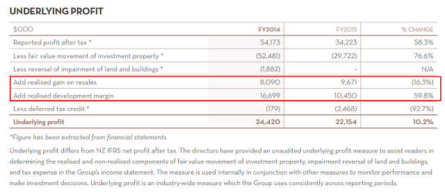
First, in the income statement if you back out the “Fair value movement of investment property”, pretax income would be close to $0. Second (as shown below), management’s non-GAAP “underlying profits” shows that profit came solely from “realized gain on resales” and “realized development margin”. This should make clear that Summerset is essentially a profit developer and heavily dependent on property value.

Summerset Group underlying profit


I also wonder what fair value really means. In Summerset’s business model, a sale of “License to Occupy” is not a true sale of property, but rather a retiree lending money to the company. Are those transaction prices really reflective of property value? The annual report does have this to say – but that doesn’t tell me much: “The fair value of the Group’s investment property is determined on a semi-annual basis, based on market values, being the estimated amount for which a property could be exchanged on the date of the valuation between a willing buyer and a willing seller in an arm’s length transaction after proper marketing wherein the parties had each acted knowledgeably, prudently and without compulsion”. 

Let’s move on to the cash flows statement, which shows similar results. Without the borrowing from resident’s loans, cash flow from operations would actually be negative. 


summerset group cash flows


Leverage and Liquidity


I have nothing against property development or land speculation. When times are good this is a fine business model. Even the liquidity risk from resident departure /loan redemption is mitigated, as Summerset contractually do not have to repay the “resident’s loan” until they receive money from a new buyer.

But it’s also obvious that Summerset would be in trouble when there’s a big property down turn. The company is leveraged 3x in terms of asset to equities. There is very little cash on hand, and the bulk of its assets are in illiquid assets such as land, buildings, equipment…etc. An economic downturn could lead to higher retiree departure and loan redemptions (to free up cash for other uses like supporting their unemployed children). Competitors could have their own liquidity issue leading to a downward spiral of asset value impairments. If resale values are lower than residents’ loans, and new sales are low (most likely in a property downturn) then the company could have trouble redeeming residents loans. At the minimum we’ll see some ugly margins if not liquidity issues and lawsuits.


What to Do?


So yes, Summerset is basically a highly leveraged builder that borrows money from grandmothers. Its profits are completely dependent on property value gains. Meanwhile news media is full of reports about NZ being in a property bubble, with one of the most expensive housing markets in the world. The stock is trading at more than 2x P/B.

All these make SNZ a short, but not yet: 1) I actually think the property market has more room to run, as much of the price gains are due to supply constraints in Auckland. 2) This is further supported by NZ’s central bank easy monetary policy. 3) Summerset’s sales were strong in 1Q15 and its stock is showing bullish technicals.

If not now, then when? I am waiting for signs of credit deceleration from the banks before acting on this. Before retirees pay Summerset hundreds of thousands for a “License to Occupy”, they have to sell their existing homes to someone else, so Summerset needs a solid housing and credit environment.

What I can see happening is the NZ property market continue to run for a while as the central bank keep lowering rates to depreciate the NZ Dollar and keep its exports competitive (think Fonterra and its farmers). The low rates encourage building and could lead to oversupply of retirement homes. Eventually monetary policy will stabilize and loan growth at the banks will slow. Slower credit and oversupply of buildings would then have a depressive impact on property values, crushing Summerset’s margins and stock price.

Interestingly, bank stocks (it’s the same big 4 that dominate both Australia and NZ) have shown weaknesses in the last month while Summerset and its peers have stayed strong. The two cannot diverge forever.


Thursday, June 11, 2015

Spotting Turns in Market Cycles

This is the hypothesis I’m working under. To the well-read there’s nothing new here, and lots of market players probably already look at the world this way. But it took me a while to piece it together, as schools don’t teach this and you don’t get this type of stuff from reading Warren Buffett. 

First though, I want to address a common misunderstanding of credit and growth.

An Essential Point about Debt and Growth


I was reading an old economic report from Goldman Sachs by Andrew Tilton. In that report there is a sentence that stood out with its clarity of thought.

“…the growth rate of spending is related to the second derivative of credit – accelerating credit can fuel an increase in growth, but credit cannot accelerate forever, and when it begins to decelerate there will be a negative impact on spending growth.”

Everyone knows that spending growth can be driven by changes in credit – duh!? But that’s actually not exactly right. It’s really the second derivative of credit. There’s a subtle but incredibly important difference here - one that most people have a hazy understanding of (including myself until recently). That lack of clarity shows up when people talk about the world’s high level of debt, and they say something like this: “You can’t cure debt with more debt. Forget about actually pay down debt, how about just stop borrowing for a start? Is that too much to ask?”

Let’s walk through this with a simple example. Let’s simplify and say the whole nation is just one person. Let’s say I want to buy some fancy car for $100k. I don’t have the money, so I borrow $100k and buy. GDP for that year is $100k. Next year though, if I don’t do anything – not paying down debt or increasing debt), GDP naturally goes down to $0! In order to keep GDP flat, I’d have to borrow another $100k to buy another car– doubling my debt just to have 0% GDP growth.

This is what Goldman means by spending growth being related to the acceleration (2nd derivative) of credit, and not just changes (1st derivative) in credit. That is the tyranny of debt addiction. GDP growth could go negative just from people borrowing less than before (in the above example, say I only borrow and spend $50k in year 2, then GDP is down 50%).

Per Federal Reserve data, U.S. total credit market borrowing (SAAR) was $2,472bn in 4Q14. GDP was $17,701bn for the same period. So new borrowing contributed to ~14% of the GDP. If everyone stops borrowing, GDP would take a 14% hit. We would have massive unemployment and social unrest.

That’s just not an option. So the sensible way to “deleverage” is not to decrease the level of outstanding debt in absolute terms. But rather to INCREASE debt at a slower rate, and try to increase income at a faster pace, so that both debt and GDP increase in absolute amounts, but the ratio of Debt/GDP declines. In this sense, we have no choice but to “cure debt with more debt”

Implications 


So what does that have to do with investments? In my last post I mentioned Kostolany’s explanation of how liquidity drives broader markets. But he gave little guidance on when that would happen. Ray Dalio though, has a framework on the typical deleveraging processes and when central banks need to provide liquidity to the market. Combining the two frameworks should us a better sense of credit cycles and turns in the equity market.

I read Dalio’s writings on credit cycles a long time ago but did not understand it completely. Turns out understanding the above dynamics of debt and GDP growth was the missing piece – particularly the “why” behind various government’s alternatives. I went back and re-read his stuff and everything became clearer this time around.

In his paper “An In-Depth Look at Deleveragings”, Dalio mapped out the typical steps to deleveraging. In the first phase of deleveraging, debt growth either decelerates or turn outright negative, and countries attempt to cope via some form of austerity. Debt to GDP ratio will go up mostly because of declines in GDP. In the second phase, austerity and resource transfer reached its limits, and central banks are forced to pull the monetary policy lever and pump some liquidity into the system.

That’s when the stock market will take off despite the weak economy. The increased liquidity mostly goes to juice up the financial markets first, since people still lack confidence in the real economy.

So here are the big picture steps: Watch out for countries that are in the start or middle of deleveraging. Ideally you find a country that had explosive growth in Debt/GDP ratios and then a subsequent deceleration of debt which triggers a deleveraging cycle. Follow that deleveraging cycle and wait for central bank to print money – that would be time to play the stock market.

Appendix: Where is the U.S. in the Cycle?


Where is the U.S. in the long term cycle? The blue line in the chart below shows nominal Debt/GDP levels. The takeaways are 1) the U.S. went on a debt binge starting late 1970’s, so it’s possible that much of our GDP growth the past 40 years are just a debt fueled mirage. 2) The Great Financial Crisis was the first time we deleveraged to any material extent since the 1940s’. 3) Despite the deleveraging since 2008, debt/GDP is still at an extremely high level. 4) the pace of deleveraging has slowed and we actually have signs of re-leveraging.


My data does not go back to show the Great Depression. But per Dalio’s data, Debt to GDP went all the way from 155% in 1930 to 252% in 1932, then down to 168% in 1937. That’s a much greater swing of leverage levels – one that probably contributed to the rise of Hitler and World War II.

Given the still high level of debt and the deflationary forces of any potential deleveraging, as well as the already high P/E levels, I have to agree with the common notion that equity markets are in for long years of low returns ahead.

Thursday, May 14, 2015

Kostolany on What Makes Stocks Go Up; Capital Flows and Technicals

Andre Kostolany on What Makes Stocks Go Up


I was doing some reading on Andre Kostolany and found something interesting. According to him, what makes stocks go up can be summarized in one simple formula: Cash availability + Sentiments = Market Trend. Basically for a market to go up, people need to have cash to buy stocks, and they have to want to buy stocks. Of the two, cash is the more important one, since high liquidity creates a rising market which would then drives sentiments.

Kostolany gave convincing examples where markets go the opposite way of underlying economic conditions. In a weak economy, people scale back consumption which increases savings rate. Since confidence about the real economy is weak, those savings get channeled to the securities market. Likewise, when central banks loosen monetary policy to support a weak economy, much of that extra cash goes to prop up the markets.

In this framework, what makes stock market go up is about monetary policy, available cash on the side lines, international capital flow and FX. Fundamentals are part of the equation, but mostly serve to influence public sentiments and expectations, as well as rationalize prevailing biases. In fact, an improving economy might lead to negative sentiments regarding corporate earnings, if higher labor and input cost lower profit margins.

This all makes a lot of sense to me. As a result I spend some time on macro the past few weeks, particularly on the topics of international capital flow, balance of payments…etc. 


International Capital Flow and Implications


My rudimentary credit analysis on the USA follows. The U.S. has current account deficit running $400-500bn the past few years, it finances that with capital inflows, which represent foreign claims on U.S. assets and effectively depletes national wealth over time. But that national wealth is incredibly high. The household sector alone has ~$83 trillion of net worth, so technically that current account deficit can persist for 150+years before U.S. networth gets depleted.

So solvency is not an issue, but how about liquidity? For now, foreigners are choosing to finance U.S consumption, presumably because 1) political stability, 2) economically U.S. being one of the “cleaner shirts” among nations, and 3) to a lesser extent strong USD appreciation the past year. Political stability will likely stay around in the coming decades, but relative economic position could change. At some point the U.S. may have so much debt that growth is weighed down by interest payments, while recovery in China and Europe can both draw capital away from the United States.

China is not helping either. In the past decade China piled up U.S. treasury bonds in its FX reserves. That helped to keep the RMB down and sustain its trade surplus. But now it seems to prefer exporting capital to other emerging markets, which not only helps the trade surplus but also enhances its influence and prestige abroad.

If capital reverses direction, that out flow could start a vicious cycle. Capital outflows would weaken the dollar, accelerating withdrawals of hot money. The Fed can raise rates in an attempt to attract capital, but that would tighten money and credit and kill the markets. The economy would have to adjust by consuming less - leading to deflation. At that point decades of accumulated foreign capital at the U.S. could rush out the door and a deflationary cycle sets in.

Value investors like to say “no one gets the macro right”. That’s probably true. I do believe though, that you have to be planned for all scenarios instead of just assume things will be fine in the long run. In terms of money management, it’s not so much trying to guess what the economy will do, but planning out how I will react to different scenarios.


A Technical Experiment - Game Planning


“Stock market goes up in the long run” is a mantra that take hold at top of markets, conveniently serve to justify ever higher valuation - “this stock trades at 25x P/E? Doesn’t matter, buy it anyways because over the long run I’ll be fine.” This mentality has two implications, 1) at some point the public become fully invested – there’s no buying power left, and stocks have nowhere to go but down on the next sign of economic weakness and 2) the market increasingly trade on technicals.

I’m convinced that the broader market is trading on macro/technical with “fundamentals” being merely an excuse to buy stocks. According to this report from Factset, market prices have grown at a faster pace than earnings expectations the past few years. Earning expectations have steadily declined since beginning of the year yet the market trickled upward. The same report also pointed out that market is reacting less to earnings beats and misses than the past – an indication that fundamentals have taken a backseat to technicals.


What to do? A sensible thing to do is target stocks that are less correlated to the broader market: small/microcap/illiquid stocks, special situations, turnarounds..etc. A major portion of my portfolio is mid/large cap value stocks though, and there I sense the fundamentals valuations are becoming less relevant – (and will be even less relevant if the market keep marching upward).

I’m in the middle of an experiment in timing the market with technical analysis. I use SPDR S&P 500 ETF (“SPY”) as a proxy for the market. Here’s the plan.

Current Trading range & initial set up
  • Current trading range is 205-212 and we’re currently at $212 per share. We are very close to a strong resistance around 212-213, a line that have held up since February. SPY tested that resistance 3 times the past month with no success. If it fails to break through again, my suspicion is that we’re due for a 5-10% correction. 
  • I shorted some SPY with 213 as a stop, so that if it breaks upward past 213 my loss would be limited. This short is ~18% of portfolio equity, with w.a. cost basis of 208.3. So I stand to lose 40bps if I get stopped out at 213.
  • I left my single names untouched. Some of them have their own stop losses anyways. These single name exposures are about 90% of equity.
  • Note that I’m actually violating proper technical trading principals here in the sense I’m jumping the gun even before a clear breakout or trend emergence. As discussed later, I risk being whipsawed)

If SPY breaks to the upside

  • My shorts get stopped out so I take 40bps of loss. But my single name exposures would still be there to take advantage of any potential uptrend.
  • Should I reverse course and get longer (would put me on leverage)? Only if a breakout proves that it established a new pricing range. That to me requires the emergence of a new support level (say 213-214 area) – mostly in the form of a retracement and subsequent bounce.

If SPY moves down
  • My short position would be showing a profit, but probably not enough to offset losses on my single names. I would think about adding to the short. But only if SPY breaks below support levels such as 205 or 200. 

If SPY moves up past 213, but that turns out to be a false move and SPY reverse downward back to say 208. Instead of establishing a new pricing range, that move would have merely expanded the range.
  • This would be tough to swallow. I would have incurred 40bps of hedging cost with no gains to show for it. That’s what you get for jumping the gun before a clear trend emerges. Should I risk another 40bps and risk getting whipsawed yet again? Only if there are proof that a downward trend is emerging. That to me requires 1) Negative fundamental news dominating the headlines (perhaps worries about Europe & China), 2) technical indicators that confirms the trend in the form of ADX/DMI, a lower low…etc. 


The way market is going, I could be stopped out of this trade as early as tomorrow. In that case we might be in for a summer “melt up” as in 2014. I will not fight it.


Friday, May 1, 2015

Week Ending 5/2/2015: Random Notes and Portfolio Review

I missed a home run last month and it hurt. Impac Mortgage (IMH) was the one. I’ve been following that stock on and off for 3 years. A week before earning came out, I had a hunch 1Q15 was going to be a good quarter, so I sat down, went through a rather detailed model and looked over my projected 1Q15 earnings. I passed, thinking the was not worth the risk and reward. When the actual earning came out it was a multiple of my forecast!! I was stunned  (I got the volume pretty much right on but was way off on the margin!). The stock ran up 100%+ in past month alone. Never have I put in that much work in a stock and turned out that wrong before. I mean if I was a portfolio manager at some fund and had a hunch about this stock, and I got my sector analyst to take a deep dive. He comes back saying it's a no go, then the stock goes up 100%...this is the sort of stuff that could get you fired.

So that hurt my confidence. That and the fact that I’ve been very uneasy with the market made me go through my portfolio again.


Healthcare portfolio.  This is a multi-leg investment to capture the long term trend in America’s aging population. I have a mix of managed care, hospitals, pharmaceuticals, and supply chain players that balance out each other.

Managed care ran up a lot in 1Q15 and was a major contributor to my out performance year to date. I decided to cut this down a little bit due to full valuation. I also see near term risk in the next year as we get closer to election year and Republicans will undoubtedly make some noise about Obamacare. But overall this healthcare portfolio is a very long term play and there’s nothing here that I would think of selling if the overall market drops 50% tomorrow.

That said, after a very successful run the past year, my expected return in the next few years is not great – maybe mid/high single digit annualized return. So if something with better risk and reward comes alone I could pare this down further.


Housing portfolio.  This is really more like housing finance and is a mix of title insurance, originator/servicers, mortgage REITS and mortgage heavy banks. The big picture idea is to go long household formation and existing home sales in the next 5-10 years. Unlike the healthcare portfolio, there are some pretty speculative names in here like Nationstar, PennyMac Financial, AGNC…etc. But I’ve cut them down to a point where I’m pretty comfortable for all remaining positions, and certainly on a portfolio basis. 

The core group here is title insurance, which I went through recently thinking about adding. Unfortunately the group look fairly valued. In terms of technicals, Fidelity National Financial (FNF) is a name showing some weaknesses. It is hovering around its resistance level and could see a big break on the downside if next Monday’s earning turn out to be a bust. If that happens I will simply take it on the chin. 


Tankers. I cut down some TNK and bought some more DHT. In the past few weeks TNK stock price has moved up to a point it became too large of a position. I'm also worried that Aframax sector (which TNK is heavy in) will not benefit as much as say VLCC or Suezmax sector. Hence the rotation into DHT, which owns mostly VLCC and Suezmax ships. Luckily, I did this adjustment right before TNK stock took a beating the past few days. The tanker trade is ~6% of my total portfolio and I have 4 stocks sharing the risk. What's preventing me from getting bigger here? 1) This is obviously a very speculative trade and cannot be long term. 2) Global crude oil demand is highly dependent on China, so the tanker trade is to some degree a long China trade -- and I'm already very long China in the portfolio.


Beijing Enterprises Holdings (392.HK). This ran up some 20% and I kept adding to my position on the way up. Although the gain is mostly due to extremely lucky timing, this is a very long term investment for me. I would consider adding more Chinese gas distributors, but only at the right price.


One big China/HK trade basket. Welling (382.HK) has ran up dramatically and I also added on the way up. But I see less upside here and will likely take my profit if the HK market takes a turn for the worse. In recent weeks I piled in and added a mix of indices and (mostly infrastructure) stocks to capture an expected spike in liquidity as well as A-H share premium.

But now that H-shares momentum has flattened out, I’m very worried about the A-share bubble popping and how that might spill over to H-shares. I'm actually investigating ways to short China as a whole while staying long in my current H-share positions, which are all reasonably valued if not outright cheap. I have tight stop losses on every one of these trades and will let the market decide for me.


Updating my views on Apple and Google:

Apple. I’m kind of surprised that the stock did not move that much given the very strong quarter. Demand for the stock could be exhausted. Part of my thesis is a "short squeeze" for those who still don't own AAPL and lags the index as a result. I now see that even a $200bn capital return plan cannot scare the implicit shorts. My original thesis could be flawed and I may cut down or exit instead.

Google. I’m holding on despite the temptation to exit given the persistently negative market sentiments here. I did some rough numbers again. My timeframe is 5 years for this. What’s the worst case? Conservatively, I think EPS can grow 8% a year. It is unlikely to be less given the solid top line growth runway and how much room they have to cut cost, and everything I know of Google.
  • 5 years from now EPS would be up 47%. But let’s say 1yr forward multiple (ex-cash) goes down to 17, that would be roughly an -18% hit. Combine EPS gain and multiple loss yields ~29% total return in 5yr, which would be about 5-5.5% CAGR. That is my worst case. 
  • On the other hand I think the upside is double in 5yr or about 15% IRR. 
  • Given the strong expected EPS growth, forward PE would have to drop to 12x at 2020 for me to lose money. 
  • So I’m holding on to this. But maybe get smaller if price moves against me.

The exposures I listed above add up to almost 70% of my portfolio. I’m in the process of revisiting my entire investment approach and don’t expect to add new names. If the market crashes 30% tomorrow, the exposures I'm less sure about (roughly half of what I listed above) would be stopped out, leaving the real long term positions intact. 


Tuesday, April 21, 2015

Week Ending 4/25/2015: The PLA is Coming

When discussing the H-shares market, "the PLA is coming (解放军来了)"  is a fun phrase being tossed around. One gets the image that Chinese money is amassing at the HK border, ready to "liberate" Hong Kong stocks. In reality, this pool of money will likely not only come from mainland China, but from the global investment community as well. In that case it might be more fitting to say  "the Eight Nation Alliance Army (八国联军) is coming". But of course, that ended up in a humiliating defeat for China, so "the PLA is coming" is a better phrase.

In my previous post, I mentioned that momentum and sentiment is in favor of the HK stock market, but did not elaborate much beyond the valuation discrepancies between A vs H shares. Here are some points to add on the liquidity/technical side (and signs that "PLA" is indeed amassing at the border)

  • People are literally smuggling money into HK
  • Talks of lowering the minimum account size for retail investor to participate in SH-HK Connect (current minimum is about ~80k USD)
  • New rules to contain A shares, such as making shares easier to short, signals the government's plan to further reduce limits of arbitrage.
  • Fund managers are forming Shanghai-HK connect funds to "go south" and take advantage of the A-H arbitrage
  • A separate Shenzhen to HK connect will start later this year.
We now have a great backdrop for HK stocks to appreciate. You already have cheap absolute valuation on various single names, and cheap relative valuation versus their A-share counterparts. But now a wave of liquidity is coming. Macroeconomics could surprise to the upside as well. Right now the China macro picture is rather conservative, dominated by talks of slower/quality growth, temporarily lower consumption due to corruption crackdowns..etc. But macro could surprise to the upside if policies start to work (loosening monetary policies, One Belt-One Road initiatives...etc) late this year.

That's much better than the U.S. picture, where you have a fully valued stock market pumped up by all time high margin debt and high 2016E expectations, all while corporate earnings are slowing.

There is another sign that capital is be amassing at HK. The USD:HKD exchange rate is at it's limits (see below). It's not impossible that one morning we wake up and found that HK decided to break its USD peg.

USD: HKD 


Recent Moves: Piling in. Let Liquidity Be a Catalyst.

I have piled into HK stocks. When the market spiked in early April, I promptly doubled down on my winners in HK, added a few more names and even bought 2 ETFs. Within the past 2 months, HK stocks went from 0% to 20%+ of my portfolio equity. That is a huge move by my standards, and I'm sitting a bit uneasy. It does not help that despite the big market run up, my profit is small due to subsequent adds at higher prices.

The work now shifts back to the fundamental side. At the end of the day, you still have to buy good companies at good prices. What this all means though, is that if I see a solid company at a reasonable prices, I'm willing to buy without any fundamental "catalyst" to unlock value. Liquidity could be its own catalyst.

ETFs:  2833.HK and CHXF 

I bought two ETFs to position for 1) A vs H share price discrepancy narrowing, 2) increased liquidity.

2833.HK is the Hang Seng Index ETF. It is way too heavy on financials and property for my taste.

To balance that out, I also hold CHXF (WisdomTree China Dividend ex-Financials Fund). This is a U.S. listed ETF that invests in H-shares but excludes the financials and properties sectors. Roughly 45% of holdings are dual listed stocks trading at steep discount to their A-share equivalents. More than 95% of holdings are eligible stocks under the SH-HK program. Average LTM P/E is in the low teens. This seem to me a less risky vehicle for the A-H valuation arbitrage.

Over the coming months my plan is to gradually replace these with single names as price discrepancies narrow.