Resources

Sunday, January 10, 2016

Fidelity National Financial Ventures (FNFV) - at $10 This is a Buy

Fidelity National Financial Ventures (FNFV) is a tracking stock that mirrors the investment arm of Fidelity National Financial, Inc (FNF). FNF’s management team, led by chairman Bill Foley, has a strong track record of making good investments, including Fidelity National Information Services (FIS), and Sedgwick CMS (now a KKR owned money machine). Management are have strong operating experience, as evident by FNF’s core title insurance business being the best run, highest margin compared to its peers.

An introduction to FNFV’s structure, portfolio investments, and track record can be found here.

The thesis is a simple one – sum of the parts asset play. FNFV's main portfolio investments are American Blue Ribbon (“ABRH”, owns restaurants and bakeries), Digital Insurance (employee benefits platform), and Ceridian (human capital management software). My analysis is shown below. At ~$10/share FNFV has limited downside.


The main uncertainty comes from Ceridian and that’s the variable in my scenario analysis. Other than that, both ABRH and Digital Insurance are fairly stable; while Fleetcor and Del Frisco’s are simply marked at current market prices.

Ceridian

Ceridian “provides human resources, payroll, workforce management, talent management, tax compliance, benefits, employee assistance and wellness programs to more than 100,000 clients in over 50 countries”. Basically it competes with guys like Oracle, SAP, and Workday. Ceridian has traditionally been a strong player in the payroll business but was late to the cloud/software-as-a-service game. It has been playing catch-up on SAAS with its main Dayforce product. Checking around the web, DayForce does have fairly good reviews (an example here).

Note that Ceridian is extremely leveraged at 9-10x Debt/EBITDA. So this is either home run or bust. That’s why I assign value of $0 for Ceridian in my downside case. I do think more likely than not Ceridian will work out though. In the latest earning call, management provided the following comments (emphasis mine):

“I think you’re seeing finally kind of an inflection point and we highlighted this earlier this year…will the growth in the cloud business outpace the decline in the harvest business? The harvest business means that we have a lot of customer – payroll customers are sitting on our service bureau platforms and we’ve been converting those to Dayforce as well as getting net new customers…. But we’re starting to see – as we speak, the growth of the cloud is outpacing the decline in the harvest business.
Basically growth in cloud business is starting to outpace decline in legacy business. This is good news. I also think the entire HCM industry have some growth runway as U.S. now only have ~5% unemployment. 


There are certain factors that made the stock cheap. As a spin-off this is kind of under the radar. Being a tracking stock in a complex FNF corporate structure does warrant some discount. FNFV is not very liquid. All these factors cause me to discount the stock by some ~15% in my base and downside cases.

In the hands of savvy management, however, these can also be upside levers. When the time is right they can provide more color around Ceridian (currently very little). Cleaning up the corporate structure would surely help. Low liquidity also means buybacks can have greater positive effect on its stock price.

Thursday, November 26, 2015

Reasons for Declining Medicare Part D Reimbursement - and What They Mean for Healthcare Stocks

In its 3Q15 earning call, CVS explained that its margins declined due to higher proportion of lower margin Medicare and Medicaid business. Here I want to focus on Medicare, and specifically Medicare Part D (the drug portion), which obviously have big impacts for the PBMs (CVS, ESRX), pharmacies (WBA, RAD), and the rest of pharmaceutical supply chain from distributors to drug manufacturers. 

Pharmacies like WBC have been talking about drug reimbursement pressure for a while. Much of that stems of their weaker bargaining position relative to PBM and payers. But what has not been discussed enough is that Medicare Part D revenue per member has deteriorated several years in a row.

Reimbursement Pressure Starts at Health Plans and Propagate Through Supply Chain


There are lots of online articles on drug costs to the enrollee, but figuring out what the government pays health insurance companies is not straight forward. Fortunately, chapter 6 of this Medpac report has a detailed explanation of how Part D reimbursement works, and even an example of how plans bid. From the same report (shown below) is Medpac’s measure of government outlay in Part D plans.


How much is the government paying health insurers

From this chart it’s clear that “expected reinsurance” has been steadily increasing, while “base premium” and “direct subsidy” have been steadily decreasing. A quick note about how this works. “Direct subsidy” is what government pay to health plans directly. “Base premium” is what enrollees pay. “Expected reinsurance” is what government reimburse the plans after drug costs exceed some catastrophic threshold. 

Since reinsurance is used to cover catastrophic drug costs, what the plans really get is direct subsidy and base premium, or what CMS calls the “National Average Monthly Bid Amount”. This is a good proxy of a health plan’s revenue, from which it needs to cover drug costs (below the catastrophic threshold) and administration costs, with the remainder going to plan profit *. The table below show that the average bid amount has been declining steadily, which led to reimbursement pressures throughout the entire drug value chain. For 2016, the industry will see another steep drop of 7.6%.


Reasons for the Decline


Why is this happening? First, what is not an adequate is the argument that health plans are not actually seeing reimbursement pressure, because the overall bid amount including reinsurance has actually been increasing. From the plan’s perspective, reinsurance just compensates for extraordinary costs and does not add to the bottom line. As for the base elements, even the MedPac report cited above - which alleges that sponsors use clever bidding strategies to maximize profits - the example given (page 163, table 6-11) clearly shows that gaming the bid system would lead to higher, not lower bid amounts (Case 3 in the example is what the plans have been doing. Based on actual claim experience the direct subsidy and beneficiary share should have totaled $46.50, but the plan bid totaled $60.00 those items).

So the way to reconcile a) ever higher reinsurance payments with b) ever lower bid amounts is that government and private sectors are both sharing the pain of higher drug costs. The government has been taking on more catastrophic risks, while private sector focused on efficient day to day administration. In this way both utilize their comparative advantage.

So the fact that bids amount have been lower every year is not about plans ripping off the government, but due to genuine industry competition. There are various explanations:
  • The “National Average Monthly Bid Amount” is weighted by enrollees. So as low cost plans win over more enrollees the weighted average would be dragged down.
  • The larger plans have been aggressive as scale allows them to lower operating expenses and push through formulary changes. 
  • Generic conversion have lowered regular drug cost, while government took on the tail risk of the Sovaldi/Harvonis of the world.
  • Medicare Advantage plans with drug benefits (MA-PD plans) can bid lower as the Part D is small portion of overall revenue (Part D bid amount will be $64.66/month in 2016E, while Part C benchmarks are easily $750-800/month)


Investment Implications


The above drivers are not about to go away soon, so this trend of lower bids and worse economics for entire drug value chain could continue for a while. In the longer term though, large players like CVS and UnitedHealth might actually benefit as lower margins drive out smaller competitors. In terms of ability to withstanding constant Part D reimbursement pressure, I would rank the various players from best to worst as follows.
  • Managed care companies. (UNH, AET, HUM) Medicare Part D in general is a smaller part of their business. If the Aetna/Humana merger goes through, the combined entity will be a major player in MA-PD plans and can continue to push bids lower to take market share.
  • Standalone PDP / PBMs (CVS and ESRX). Both CVS and ESRX are large players in the standalone PDP space. They are at a disadvantage relative to managed care companies but have been able to exert strong bargaining power over the rest of the supply chain.
  • Pharmacies (WBA, RAD) and drug distributors (MCK, ABC, CAH). These have weak bargaining power. The pharmacies in particular have been beaten up by PBMs. Their only hope is more consolidation as in the Walgreens Rite Aid deal. The major pharmacies and drug distributors have also teamed up to get more market power.
All the industry participants above have low margins. The managed care companies even have legal caps on their profitability. So going forward the big costs savings will have to come out of the drug manufacturers, specifically the specialty drug companies. The specialty drug companies are a totally different game. On the one hand they are prime targets for price cuts. On the other hand it’s hard to cut prices without political action, and even if price cuts go through these manufacturers have some fat margins anyways.

I am holding on to my UNH and AET shares despite the political rhetorics sure to come in 2016. I particularly like the idea of a combined AET/HUM dominating the growing Medicare business. CVS is a tough call as it a well-run company but its pharmacy business will likely bear reimbursement pressure for years to come.


* Notes: Some analyst reports calculate plan revenue as average bid amount + enrollee premium. That is incorrect, as the enrollee’s base premium is calculated as a percentage of the National Average Monthly Bid Amount, which implies the latter is inclusive of enrollee premiums)


Monday, November 16, 2015

Gold Call Options

I bought a small amount of GLD call options today.

I got into the June $115 call for $1.59. I think this is a much better way to gain exposure than going outright long. With GLD trading at $103.5, maximum loss on this trade is only 1.5% of the long exposure obtained. I'm also long USD (currently against NZD and EUR), so some gold will help in case the Fed hike thesis falls apart.

Gold has been beaten down to multi-year lows and I can understand why. The Fed can't stop talking about raising rates. Inflation is no where in sight. Marginal costs for gold producers keep declining over the years, and will get lower if the US dollar strengthens. Jewelry demand, roughly 50% of total demand, will likely be weak in a low growth environment. Finally, after a massive build up over the past decade, ETFs has been decreasing their gold holdings the last couple years.

So why a long position? These call options are a low risk, high reward way to go contrarian on the consensus view that Fed will raise rates in December.

First take a step back. Gold has four functions: 1) as a safe haven/physical currency, 2) inflation hedge, 3) jewelry, 4) industrial use. Right now the only reason for anyone to own gold is the first one - gold as a currency. This is really the flip side of US dollar strength, which has everything to do with market's expectations of a rate hike.

Expectations

It wasn't that long ago (just September!) that the Fed failed to raise rates and cited risks in China and low inflation. Every other day some Fed officials (Lacker, Bullard, Lockart, Brainard...etc) took their turn going rogue on media and gave contradictory statements.

Now, just a couple months later, everyone is supposed to have suddenly fell in line and agree to raise rates? That hardly seems credible to me.

Last year's experience made clear a few things about the Yellen Fed regime. First, the Fed takes into consideration a lot more than its dual mandate of inflation and unemployment. Some of these unstated factors include general market stability, US dollar strength, and yes - China. Second, the Yellen Fed does not like to surprise the market, so October's hawkish Fed statements was just a way for Yellen to raise expectations of a December hike in the market. Put another way, October's Fed statement was just to keep their options open. Finally, we learned that it doesn't take much for the Fed to delay that rate hike -- perhaps permanently.

Given the lessons above, and all it takes is a weak inflation number, a couple bad numbers out of China, or another market meltdown to lower the probability of the December hike.

As for gold, market expectations about the rate hike is what matters. If any of the above happens, the call option will likely be a winner. There's also very little downside. Depending on how macro data comes out, I might increase this option position.

Friday, October 30, 2015

What’s Dragging Down Core Retail Sales?

One of the biggest questions in corporate earnings is how the US consumers are doing. We know housing continues to recover, if in a sluggish fashion. We know auto sales are doing well, driven by light trucks. How about retail sales? 

Headline retail sales have continued to increase but showing signs of deceleration. This number is heavily influenced by auto & auto parts though –which we already know is strong. On the other hand, gasoline prices have dropped significantly and that drags down the headline numbers even though it should benefit consumers.

So I consider “core” retail sales – excluding auto and gasoline sales – as a more accurate reading for U.S consumers. The growth in this number is shown below.


Notice that post 2008, growth in “core” retail sales have hovered around 3-5%, slower than the 5-7% range pre-crisis. So I dug a little deeper to see which sector is dragging this down.

The Census Bureau report divides retail sales into 13 categories - motor vehicles, furniture, gasoline, building materials, and so on. Going through the data, I found the biggest drags come from 2 sectors: general merchandise stores and building materials.

The contributions of these 2 sectors to core retail sales growth are shown below.


The declining growth in general merchandise stores might have something to do with offsetting growth in online shopping (although apparently not enough to offset overall sales since the headline number does include e-commerce.) .

The other major drag on growth is the “building materials & garden equipment & supplies dealers” category. Growth has recovered but has not yet reached pre-crisis levels. The good news here is that new home sales – as shown by the link in the first paragraph – should have plenty of room to grow.


Looking out the next few years, I can see a housing pick up driving core retail sales up toward pre-crisis levels. Gasoline prices will also stabilize and be less of a drag on headline growth.

Friday, October 16, 2015

Which Securities are Most Likely to Trend?

The title really should be “finding the least efficient markets – Part I”. But that’s such a broad subject I will just focus on one little part of that here.

Greenblatt’s book “You Can Be A Stock Market Genius” outlined some intuitive ways to find inefficient markets – spinoffs, M&A, bankruptcies…etc. But one of the most common forms of inefficiency is right there on the stock chart – the trend.

If you visualize the price chart of a perfectly efficient security, what would that look like? I imagine it would have sudden gaps up or down as new information comes out, followed by flat lines in times of no news. This is because in a perfectly efficient market, rational investors absorb and digest the same information instantaneously, and that should immediately be reflected in prices.

But often we observe security prices that trend. Prices go up for 3 days in a row, a week in a row…and so on. To me that is proof that the market is not perfectly efficient - there are delays in information dissemination, interpretation, and actions on the parts of investors. Whatever the causes, the trend presents good trading opportunities.

The trend is your friend. But how do you identify securities that are most likely to trend? We need ways to quantify “trendiness”. Here is one simple way to do it: count the number of times where prices move in the same direction (“sequence”), divide by the number of times when prices reverse (“reversals”). This is called the “Cowles-Jones ratio” (CJ ratio).

For example if you have price time series data that goes like this: 1, 2, 1, 2, 1, 2. That’s 5 reversals and not a single “sequence”. The CJ ratio would be 0. On the other hand, if your data is this: “21, 22, 23, 24, 19, 18” That’s 4 times where price moved in the same direction and 1 reversal. (22, 23, 24 all moved in the same direction, then a reversal on 19, and finally 18 moved in the same direction as the last number). In the latter case the CJ ratio would be 4 / 1 = 4. So if you go long the security whenever price first ticks upward, your chance of winning is 4 times that of losing.

Calculating this number for SP 500 components from 1/1/2013 to 9/30/2015, I find the average CJ ratio to be 97%. I expected a number close to 1 so this is reasonable. Below are the stocks that with CJ ratios that are 2 standard deviation above the mean – i.e the trendiest stocks since 1/1/2013.


So the “trendiest” stocks have CJ ratio around 1.1 – 1.2 range. A simple strategy would go something like this: go long whenever you see prices shift directions and go up; and short if prices reverse and go down. Your win percentage would be better than 50/50.


Now check out the common currency pairs. Total trading days are more than those for stocks because the stock market get various holidays off.


Note that even the least trendy FX pair is more likely to trend than the trendiest of stocks! That makes sense to me. The forex markets are full of non-economic players like central banks and commercials for whom profit maximization is not the top priority. Then you also have mom and pop participants. When my dad wants to buy some NZD he literally goes to the local banking branch and buy them! That surely creates lags and opportunities not seen in the stock market.

These numbers change depending on what time period you use. But in general I do find currencies to be trendier than stocks.

There are other ways to measure trendiness – perhaps one can quantify autocorrelations, or run backtests using simple moving average crossover rules and then rank the results. As I learn more ways to detect trends (and get more mathematically skilled) I will post my discoveries.

Friday, October 2, 2015

Notes on Archer-Daniels-Midland (ADM)

ADM is one of the largest grain processors in the world. The 4 major segments are 1) Agricultural Services - which store/transport/trade commodities, 2) Corn Processing – this turns corn into sweetners and starches. Importantly this segment also includes ADM’s ethanol operation. 3) Oilseeds Processing – where ADM does crushing & origination. Soybean related products are key here. 4) Wild Flavors – a new segment that does specialty food ingredients.

Why am I looking at this in the first place? My bull hypothesis is as follows: 1) As a processor that takes soybean and corn as inputs, weakening commodity prices should help ADM’s margins. 2) Despite the cyclicality, over the long run demand for ADM’s products should be very stable. 3) As the world consumes more proteins, ADM’s volume should grow at higher than GDP.

I also think ADM is a good company to track due to availability of related data. I can monitor data from commodity futures and USDA to constantly update, prove, or disprove the above hypothesis. Things like soybean crush spread, ethanol prices, currencies are available in real time and inform one’s view on ADM.

Segment Contribution and Drivers


Here is a quick rundown of each segment’s contribution to operating income (last twelve months), as well as their drivers:

Oilseeds processing (42% of operating income)

  • The key grain here is soybeans so I compared current soybean crush spread against historical levels. Current industry crush spreads (see appendix at the end of the article) are near all-time high but declining, which points to downside for ADM. My first bull hypothesis – that declining commodity prices should help ADM’s margins –thus appears already played out and in fact fading. 
  • However, ADM’s oilseeds margins (in terms of $ per ton processed) were stable the past few years even as industry crush spreads fluctuated. My guess is ADM will be relatively stable when industry spreads decline as well. But I certainly would not count on much upside from margin expansion. 

Corn processing (24% of operating income)

  • Operating profit from ethanol was down ~$220mm in 1H2015. Some of that will be recoverable as ethanol margins recover, creating upside in the segment.
  • However, it seems that analysts are already building in ethanol price recovery (perhaps due to expectations of oil price recovery). Consensus has EPS of 3.08 and 3.40 for 2015E and 2016E. This 10% growth will be hard to come by without ethanol at least stabilizing. Besides, the days of $100 oil are over and ethanol margins are unlikely to fully recover to past levels.

Agricultural services (27% of operating income)

  • This is storage/transportation/trading…etc. Historically profit here relies on level of US exports, which is a function of how competitive US is versus say, Brazil. With USD strong and the Brazilian real weak, this segment is unlikely to see much advantage. The near upside here is 1) El Nino somehow destroys Brazilian crops, and 2) US has a great crop. 

Wild Flavors (6% of operating income). This could be a growth area for years to come but not enough to offset the importance of the other segments.

Upside Assessment and Current Action Plan

Looking through the main segments, I just don’t see much earning upside beyond those already factored into the consensus. Thus returns will have to come from multiple expansion, which will likely happen if ethanol stabilizes and exports don’t fall apart. In terms of valuation, right now it trades at 11.9x TTM vs 10yr median of 13.3x. That’s a 12% upside from recovery in multiples. In terms of downside, soybean crush margin can weaken, ethanol stabilization can come later than expected, and Brazil and China can enact policies that hurt US competitiveness and export levels.

This is not enough for me to get in. For now I will sit on the sidelines and wait for fundamentals to get better.


Appendix: Historical soybean margins

I calculated these from front month futures data and the formula Soybean crush = soybean oil (in cents/lb) * 0.11 + soybean meal (in $/short ton) * 0.022 - soybean prices (in $/bushel).  The crush spread is still higher than historical because soybean meal is a larger contributor than soybean oil, and soybean meal prices has not came down as much as the others.

historical soybean crush spread ($/bushel)

soybean complex historical data


Friday, September 11, 2015

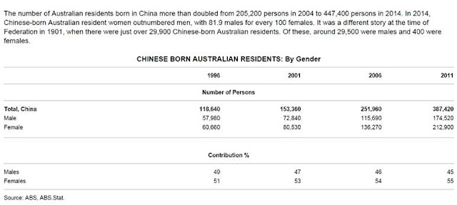
Australia’s Trade with China: Export Iron Ore, Import Women

Australia’s latest balance of payment data included a special case study on trade with China. Scroll to the bottom of that link and you’ll see some interesting stats. 

Australia’s Trade with China: Export Iron Ore, Import Women


These male to female ratio looked a little skewed? Especially we’re talking about China here - a country known for too many men.

And Australia gets them young too.


I knew Australia has a trade surplus with China, but I didn’t know it was this good!